A Minecraft Studio · 2022-2023 & 2025-Current
Luconia Studio
I worked on the Branding and Design of their products. However I also dabble in community management there, mostly for their 14k Discord server.
Roles
- Design
Stack
Figma · Aseprite · Minecraft Server Network · Community Management
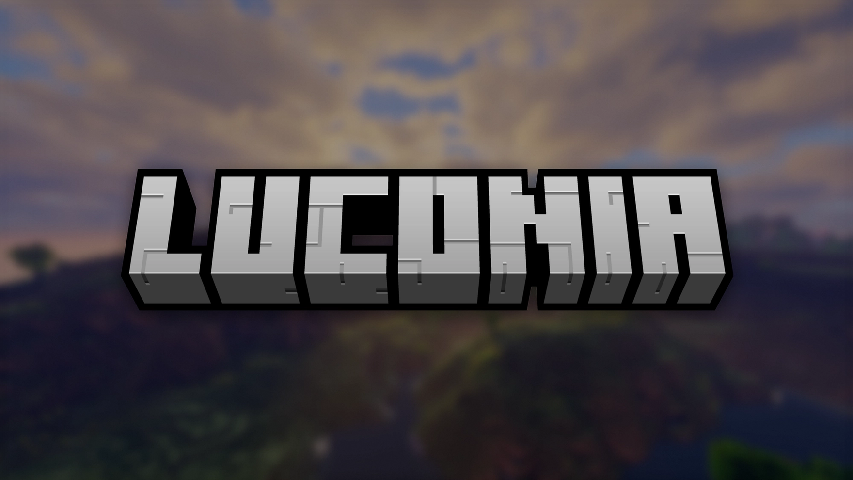
A friend of mine has joined Luconia Studio as one of the owners. Then he swiftly invited me as a Community Manager initially, but further down the line I got more and more interested in Design and started doing Design work for Luconia as well. The logo is something that has been there from the start and we haven’t gotten to redesigning that yet. However the rest around it has changed a lot during my years at Luconia Studio. We had a Minecraft Server Network back in 2022 with a lot of different game modes and we had built a lobby for that, which looked like this:

We have used that as a banner and for other assets for a long time.


At the time of me joining Luconia, I also redesigned the texture pack client that was the most popular project at the time and was originally designed by an old maintainer of the texture pack. It allowed for mod-like behavior, while being installable across mobile devices, consoles and the Windows Edition of Minecraft. But as you can see, the designs of mine were still quite immature and lacked a lot of basic design principles, that I had to learn over time.

However, we wanted to shift away from that, as we haven’t used the lobby really and also we couldn’t maintain the server network anymore at that time. We wanted to capture our landscape from our SMP (Survival Multiplayer) at the time and wanted a brighter picture that looked more friendly.

At that time I have transitioned away as a community manager, due to my time being taken up elsewhere. Design-wise Luconia has been quite stale for over a year at that time, but then I came back onto the project as a Community Manager and Designer. This is also the time I have stepped up my design and made a proper promotional image. However at the time we used Nunito as our brand font, and it didn’t quite fit and it wasn’t as unique.
So I decided to rebrand Luconia completely and also make it more consistent. New Icons, colors and a better font selection. While this is still something on-going, as Luconia has multiple projects surrounding Minecraft, we have made some great progress. For the colors, I have used a method that I have used for other projects at the time and a method I still use today. Basically there are four different layers of elevation for content areas like the sidebar, main content, tooltips, etc. Then there are so called modifiers, that automatically adapt to its background and should be used for the actual content like buttons. That way the content remains visible, no matter in what context they appear. For the fonts I used a heavier and less rounded font for the headings, called General Sans. This more closely matches the blocky Minecraft aesthetic that we want to replicate going forward. The body font now uses Geist, which is the gold standard I have been using for a while, as it has some unique features that look really balanced in all cases.


We also now make use of all-new pixel icons, to match the pixel art that can be found in Minecraft itself and we also want to feature custom-made pixel art for our upcoming projects with shading and all the jazz. However for simple UI and other assets, we make use of a pixel icon pack made by Nucleo, which I purchased as the designer on the team.

We have some cool projects in the pipeline with a never before seen design that will incorporate even more personality and similar principles to what I’ve shown above. I wish I could share them right now, but since it’s unreleased it has to be added to this case study at a later time.